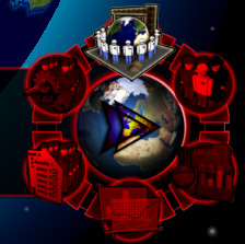
After thinking a bit more about the control center, I came to the conclusion that the four buttons I initially had in mind (and more or less implemented) were not enough, which in the end would mean that the player would have to press more than just one button to get to some of the important parts of the game. And since this was something I really wanted to avoid in my current game, I had to redo the buttons and now there are six buttons on the control center.
But I didn’t only up the number of buttons, but I also redesigned them and exchanged text for some easy to recognize icons. Not only do they take up less space, but they also look a lot better. And moreover I also added an additional animation effect to the one that you could see in the flash animation I showed you some entries ago : Icons now not only just fade in, but they also grow when the cursor moves over them and shrink back to normal size when leaving their mouseover area. In the shot I have selected one icon, so you can see how it looks after fully growing and fading in, though it’s looking much better in motion.
