Odd title, but it perfectly describes my “workflow” when it comes down to the GUI of “Phase 2”. But since the user interface is such a crucial part for a complex strategy game I don’t feel bad when putting hours and hours (and days) into optimizing the interface of a single “window”, especially seing as how horribly one of my old drafts looked. And yes, I really like the current UI. It has a nice flow, looks pretty sleek and has a great usability.
But after the last redesign of some of the “windows” (though they’re no longer freely moveable, so I should better call them areas or screens) several weeks ago I wasn’t 100% satisfied with them anymore after taking a look at them recently. Especially the partitioning wasn’t very well and it was hard to distinguish the different parts of it, e.g. where the current selected tech is displayed and where your active research is located. So I sat down, did some prototyping and finally (hopefully) found a good way of making it easier to distinguish information within the new windows with a new UI element called “header panel”. It’s the one that looks like a table header with an arrow-like captionion part on the left and a normal text (and icon if selected) part on the right. I’ll now use them to separate important parts within a window and to depict important sub-information by indenting and scaling them.
So take a look at the newly re-designed research section. The left one shows the old version, the right one shows the new version :

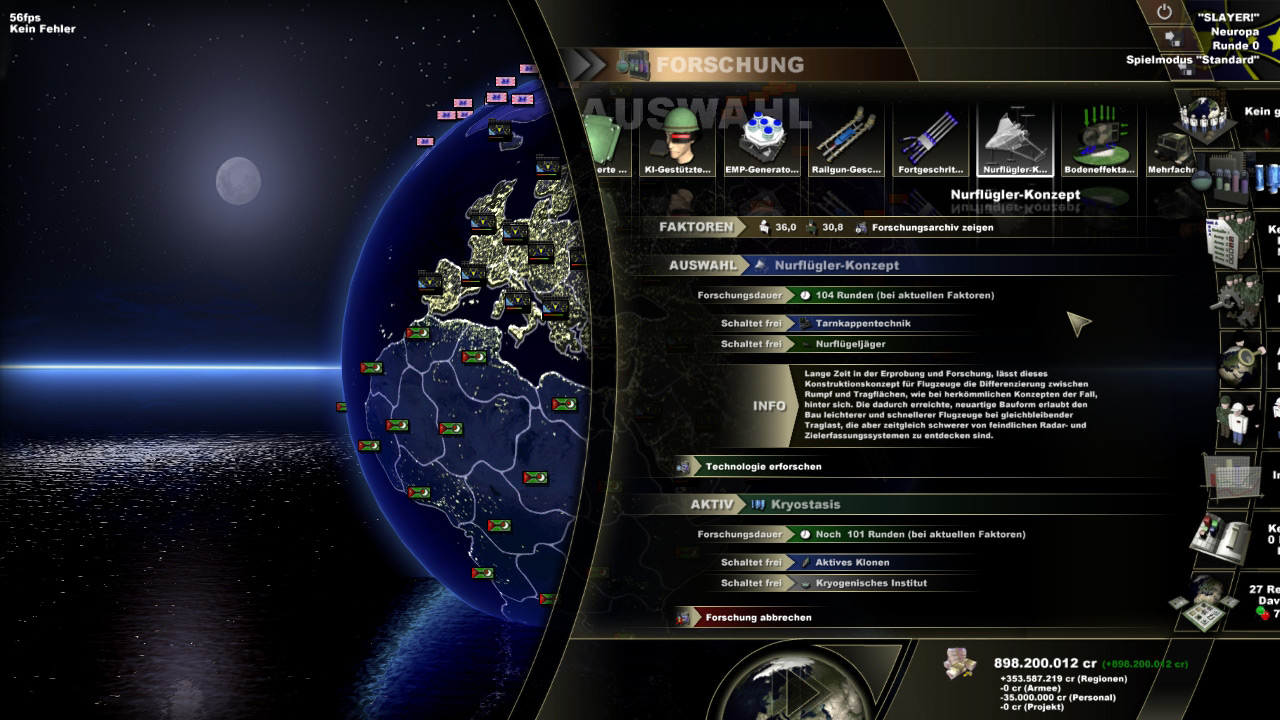
Though the old version may look nice, I felt that it lacked overview and therefore made it hard to orient yourself and to find the information you’ve been looking for. So the new design with the headers changes this and makes it much easier to navigate through the information presented. Though note that this is still (as usual) work-in-progress, but not much will change anymore.
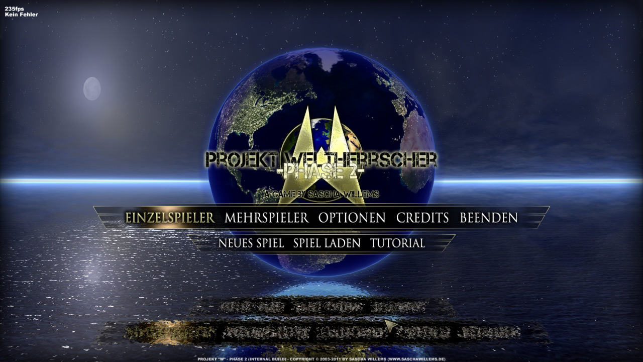
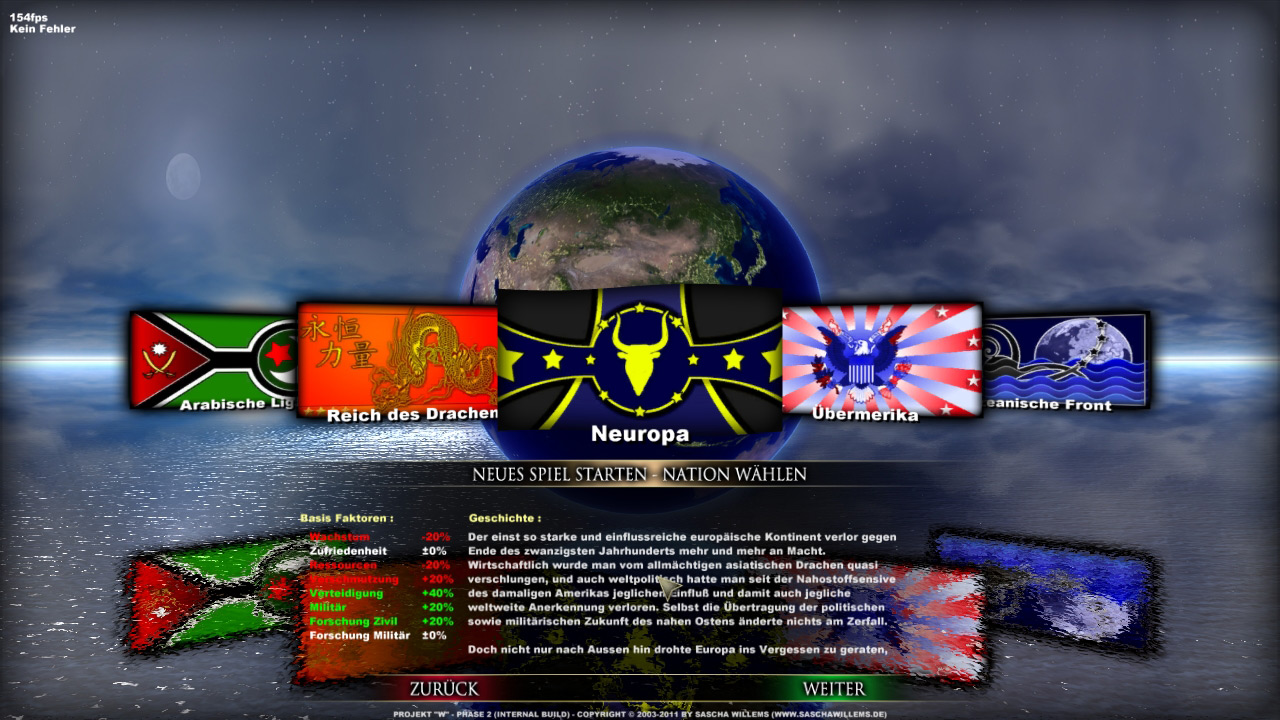
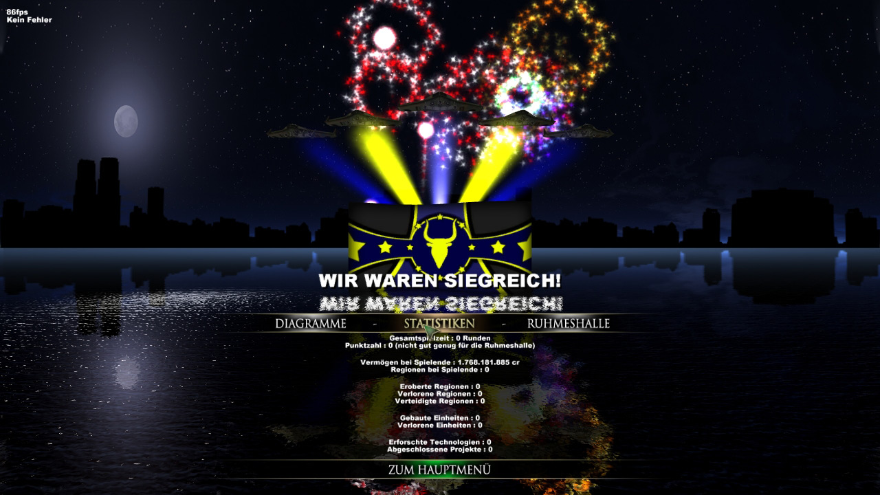
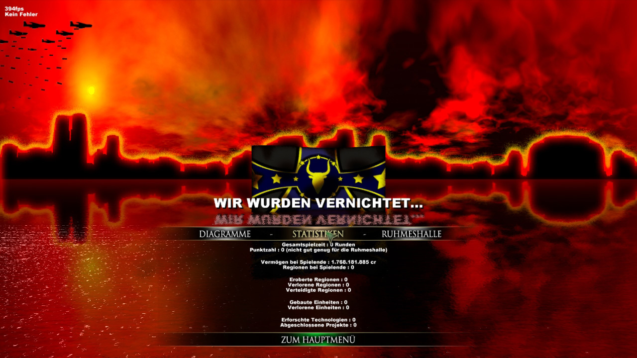
And I’ve also been reworking the main menu and the result screens. Those two have been on my list for a long time now but I never got around working on them. One problem with the main menu from “Phase 1” was that it was created for 4:3 displays and therefore looked pretty bad on all (now widely spread, including myself) widescreen displays. So I dumped the whole old design and made a new simple one that is centered and in-line with the rest of the game’s look, also using the day-night transition. It looks more minimalistic, but that’s the “theme” of the whole UI redesign anyway, makin the UI easier to use. And then the result screens : the original ones were done quickly and I never liked them. Back when I made them I actually didn’t had the motivation to do “cool” ones, but instead used the same design for winning and loosing with a slight different header. So I sat down and created new loosing and winning screens (that are now also used in hotseat, instead of the plain boring dialogs of dead nations in “Phase 1”) that fit their purpose, are in line with the new UI-design and are also animated. So if you win you’ll have fireworks and airplanes with colored (depending on your nation) smoke that fly above your head. Also included are more informations than in the old result screens, though I plan on adding even more info here, as there is plenty of space now. But since pictures are worth much more than words, just take a look at them :
And yes, I plan on making a video of all these new UI changes, as especially the result screens look much better in motion. But there are still parts and areas of the UI design that need to be finished before I’ll put them on video. But rest assured, you’ll get a new video in the near future, also showcasing a lof of new stuff concerning manual battles.